Blog 135 block design & features
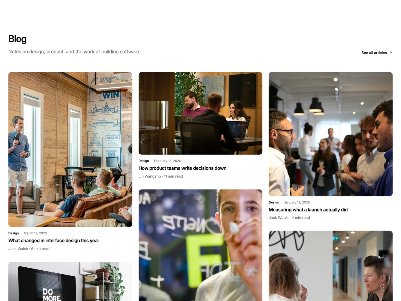
The block opens with a start-aligned heading, a short description and a "See all articles" link with an arrow that nudges on hover.
Posts flow into three CSS columns. Each card cycles through a different photo ratio, from tall portrait to wide landscape, so the grid settles into an uneven masonry rhythm. Under each photo sit the category and date, the title and a plain author and read-time line.
On hover the other cards fade back and a light, blurred panel slides up over the bottom of the photo with the post summary. Keyboard focus shows the same panel. The summary sits inside the photo, so the columns never reflow. Reduced motion keeps the fade and drops the slide.
On tablet the grid uses two columns, and on mobile the posts stack into one.