
Stepper Sizes 1 component design & features
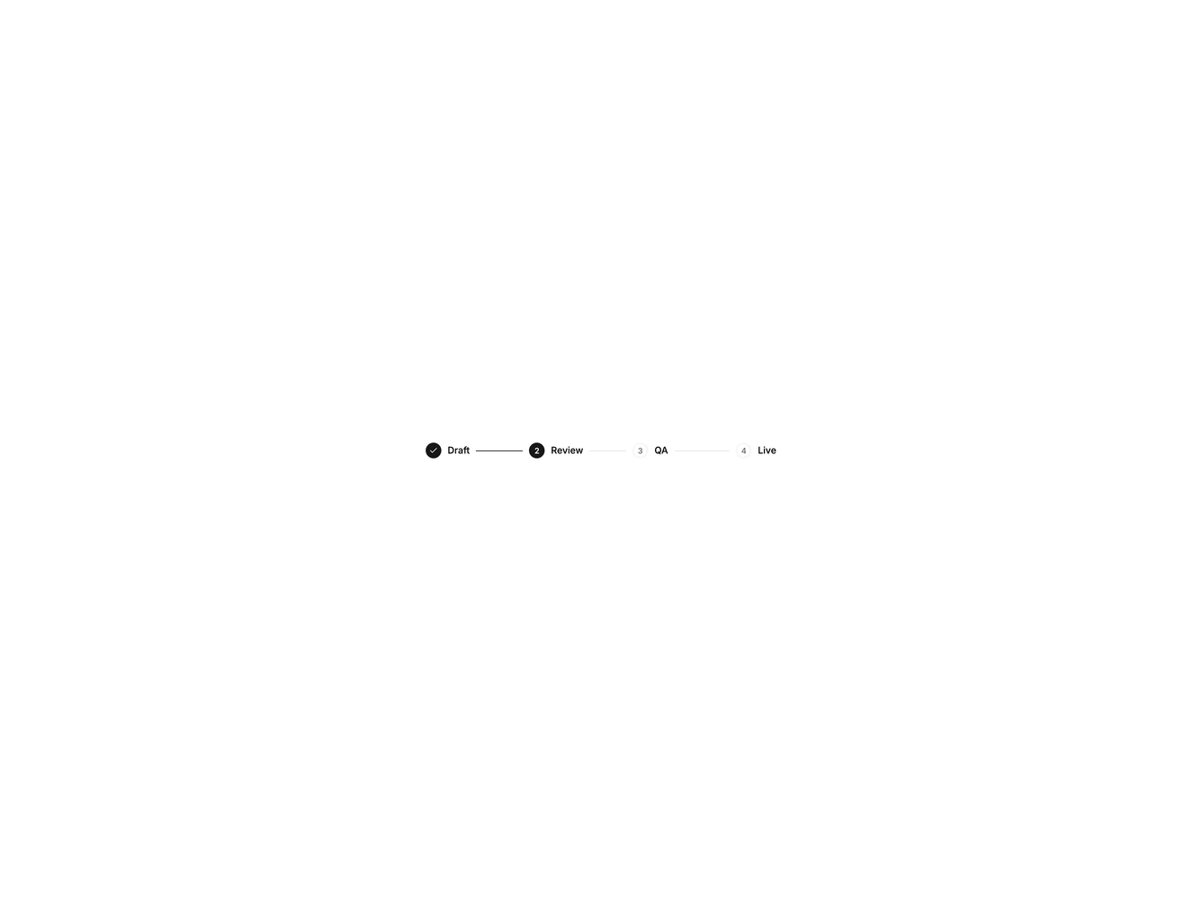
This example shrinks StepperIndicator and title text for a compact horizontal stepper that fits toolbars and card headers.
Compact steppers are useful in admin tables, editor side panels, and any dense UI where a full-size stepper would dominate.