
Input Special 4 component design & features
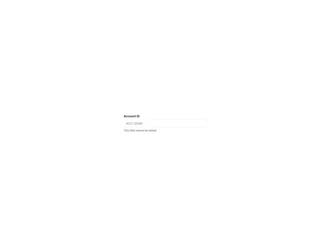
This example uses the shadcn Input component to demonstrate disabled input. Composed with Label. Includes disabled state.
Specialized input patterns suit checkout, media uploads, and scheduling flows where the native input type or companion controls carry extra meaning.