
Dialog Standard 1 component design & features
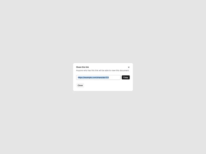
This dialog example uses the shadcn Dialog primitives with DialogTrigger, DialogContent, DialogHeader, DialogTitle, and DialogDescription. The body includes a read-only link field with a copy action and a secondary close button in the footer.
Standard dialogs handle lightweight confirmations, share links, and short forms without leaving the page. Use them when content fits in a single column and does not need scrolling or multi-step flow.