
Choicebox Standard 1 component design & features
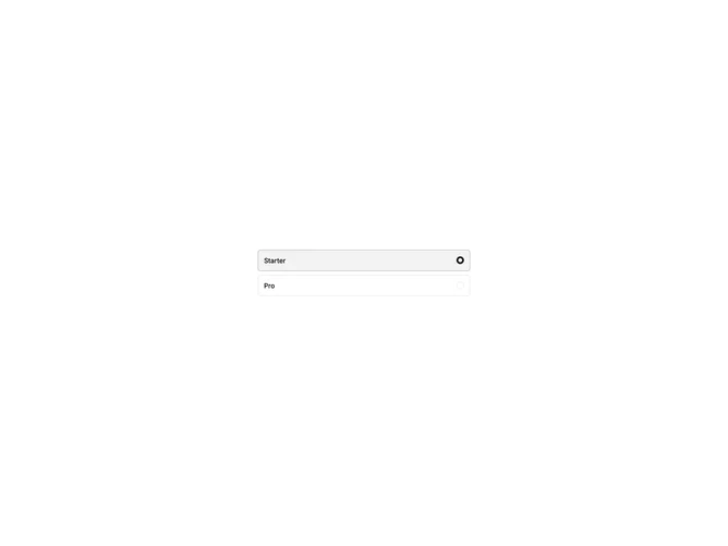
This example uses the Kibo UI Choicebox component with two card-style radio options and a default selection.
Choiceboxes work well for plan pickers, shipping methods, and any setting where options need more context than a plain radio list.