
Checkbox Standard 4 component design & features
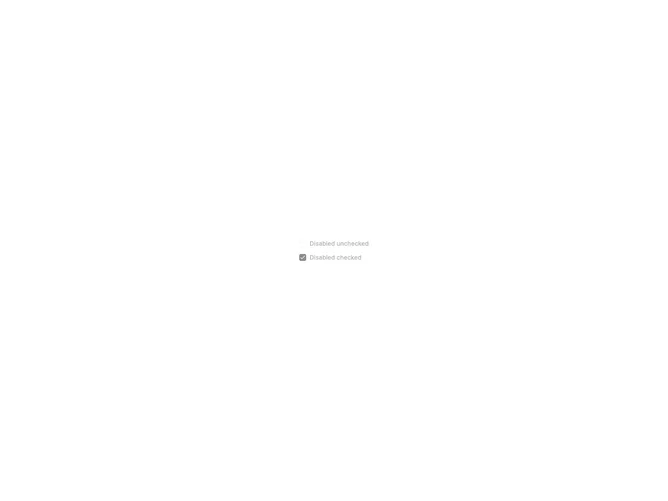
This example uses the shadcn Checkbox component with Label in a disabled state where the input cannot be toggled.
Checkboxes with descriptions suit marketing preferences, notification settings, and privacy controls where each option needs a short explanation.