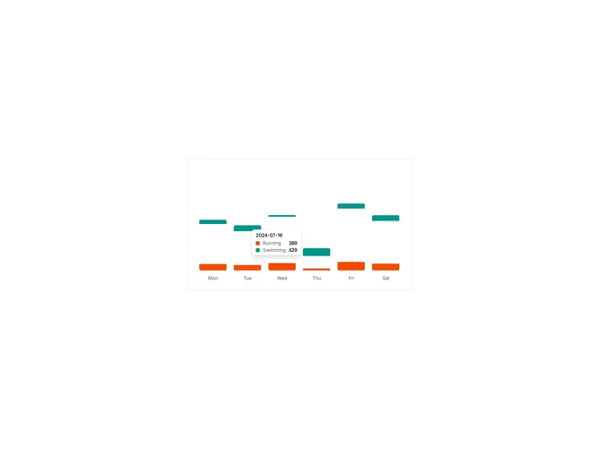

Chart Tooltip Default component design & features
This example configures the shadcn ChartTooltipContent component for a bar chart with the default variation. It shows how tooltip label, indicator, and formatter props change what appears when hovering chart data points.
Custom tooltip configurations appear wherever charts need tailored hover details, such as financial dashboards, analytics tools, or data exploration interfaces.