
Card Standard 1 component design & features
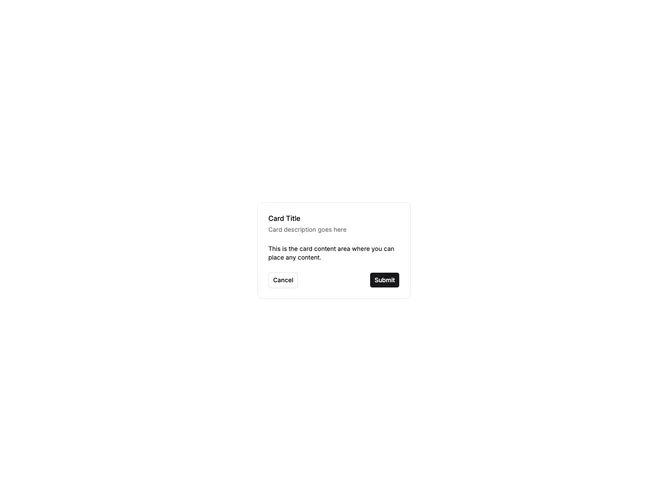
This example shows the standard shadcn Card structure with CardHeader, CardTitle, CardDescription, CardContent, and CardFooter. Cancel and Submit buttons in the footer demonstrate a typical confirmation or form action layout.
Standard cards work as containers for settings panels, confirmation dialogs rendered inline, profile sections, and any content block that needs a titled header and action footer.