Button Morph Fold 1 component design & features
Hover to reveal a sliding fold background. Text color inverts as the overlay scales up from the bottom.
Fold buttons add tactile hover feedback on primary CTAs without leaving the shadcn button shape.
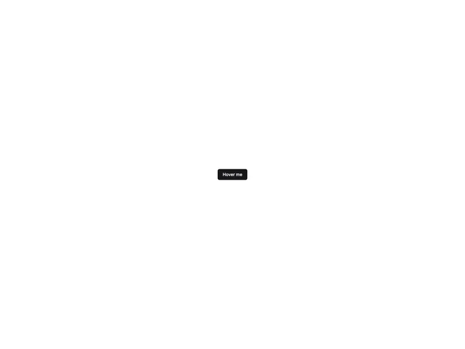
Button with a fold reveal hover effect and inverted text color.
Hover to reveal a sliding fold background. Text color inverts as the overlay scales up from the bottom.
Fold buttons add tactile hover feedback on primary CTAs without leaving the shadcn button shape.