Button Glow 1 component design & features
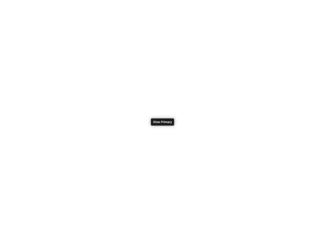
A primary button with a colored glow shadow that intensifies on hover. The glow uses the primary color at 40% opacity, expanding to 60% on hover.
Ideal as a hero CTA or in any dark-themed section where the glow provides visual hierarchy.