
Rob Austin - Mar 6, 2026
Shadcn Figma Kit: Design shadcn/ui Blocks in Figma with Real Tokens
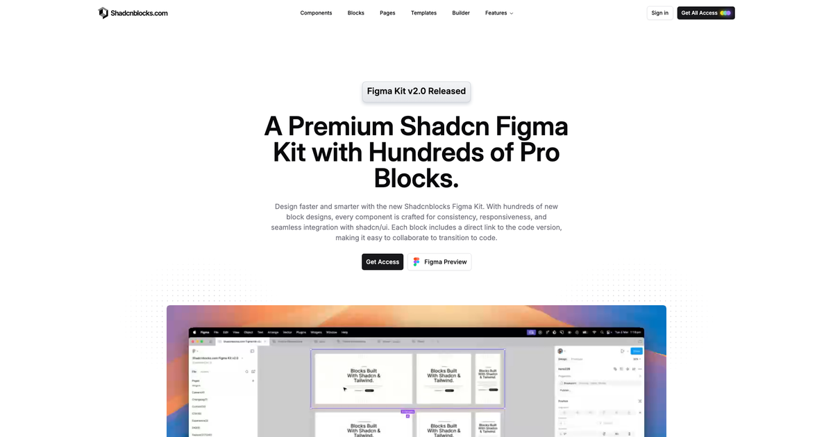
A Shadcn Figma kit is only useful if it matches the code. The Shadcn Figma Kit on shadcnblocks.com is built for that: official shadcn/ui CSS variables as Figma variables, light and dark mode, and hundreds of block frames that point back to the React source.
It ships with Premium and Elite, on both individual and team licenses. Preview the file first, then download it from the Figma product page. Setup notes live in the Figma docs.
What is in the Shadcn Figma Kit?
Version 2 is the current kit. It is not a dump of screenshots.
We launched the Figma kit in April 2025. Since then we have shipped several minor updates and a full major rebuild in March 2026. See the 2025 launch changelog and the v2.0 changelog.
- Base shadcn/ui components rebuilt as Figma components so buttons, inputs, dialogs, and tables stay in sync with our component examples
- 500+ pro block designs with desktop, tablet, and mobile variants, published in the Assets panel
- Token names that match CSS variables — the same names you set in a theme or in
globals.css - Light and dark mode through Figma variables, plus Shadcn, Tweakcn, and custom themes
- Typography mapped to Tailwind text classes
- Lucide icons with instance swapping
- A link on each block frame to the coded version in the block library
The Figma kit docs cover the two-layer variable setup: theme and mode switch independently.
How to use it with the rest of Shadcnblocks
- Open the Figma product page and preview or download the kit.
- Browse the matching layouts on Blocks or a full pre-built page.
- Install the coded version with the CLI, MCP, or the IDE extension.
- Keep colors aligned with a theme or DESIGN.md.
If you already know the block you want, start from the docs getting started and swap instances from the Assets panel.
Frequently asked questions
Which plan does the Figma Kit come in?
Premium and Elite, on both individual and team licenses. See the Figma page for the download.
Are the blocks built so they are part of the Figma assets library?
Yes. The blocks are also built as components so you can select and swap blocks from the asset library.
Are the blocks responsive?
Yes. Every block has responsive designs for Desktop, Tablet, and Mobile views.
Does it support dark mode?
Yes. v2 uses Figma variables for light and dark. Theme and mode are separate layers. Details are in the theme system docs.
Can I use Figma MCP with this kit?
You can point a Figma MCP client at the file. We have a short note in Figma MCP docs. For installing coded blocks from chat, use the Shadcn MCP against the registry instead.
If you design in Figma and ship in shadcn/ui, this is the file we use internally. Start on shadcnblocks.com/figma, then pull the same sections from Blocks or Pages.
— Rob