
Wishlist 6 block design & features
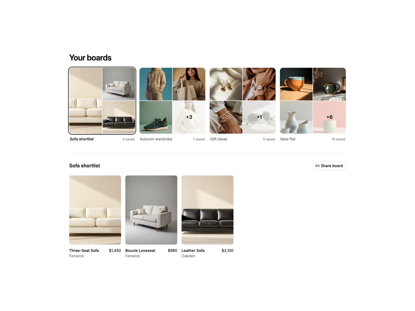
A Shadcn UI wishlist that groups saved products into boards such as Sofa shortlist, Autumn wardrobe, Gift ideas and New flat, each holding a different number of items. The top row shows every board as a square cover built from its own photos: three items become one large photo beside two stacked ones, and boards with more than four show a two by two mosaic with a plus count on the last tile. The board name and saved count sit underneath. Below a divider, the selected board's products appear in a five column grid of portrait photos with the name, brand and price.
Choosing a board outlines its cover with a ring and fades the product grid over to the new set, while the other board names dim. Hovering a product reveals a small remove button in its corner, and removing an item updates the board's count and cover. A Share board button beside the board title copies a link and confirms with a check for a moment. The look is calm and photographic, with rounded image tiles, almost no chrome and motion limited to short fades.
This is a moodboard style take on a wishlist that leans on imagery more than lists or tables, and the uneven board sizes make it read like real saved collections. Boards and items are passed in as props, and the covers handle anything from a single item upwards. On small screens the covers drop to two columns and the product grid to two.