Stats Card 5 block design & features
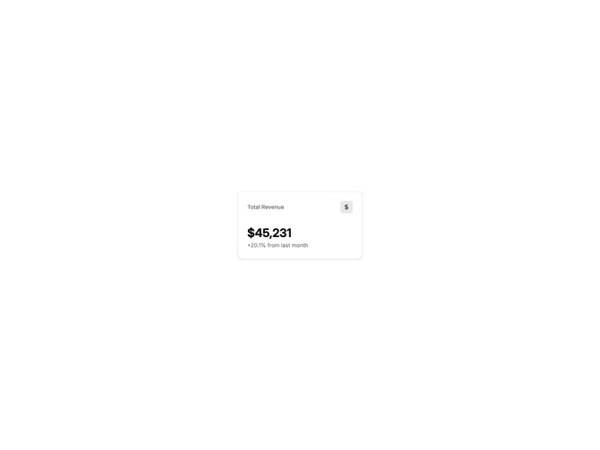
StatsCard5 is a metric card with an icon badge in the header. The layout places the title on the left and a small icon in a rounded container on the right. Below sits the large metric value and a subtitle line with additional context.
Light card surface with the icon displayed in a subtle primary-tinted background. The icon uses the primary color at full opacity while its container uses a low-opacity variant. Header items are horizontally aligned with space-between. Value and subtitle stack vertically below.
This is a polished variation of the basic stats card that adds visual categorization through icons. The icon badge provides quick visual identification of the metric type. Common icons include currency, users, shopping cart, and trending indicators. A clean, professional pattern frequently seen in admin dashboards.
The icon prop accepts predefined types for common dashboard metrics. Works well in grid layouts where icon differentiation helps users scan multiple cards quickly.