Skills 1 block design & features
This component provides a reusable UI element for your application.
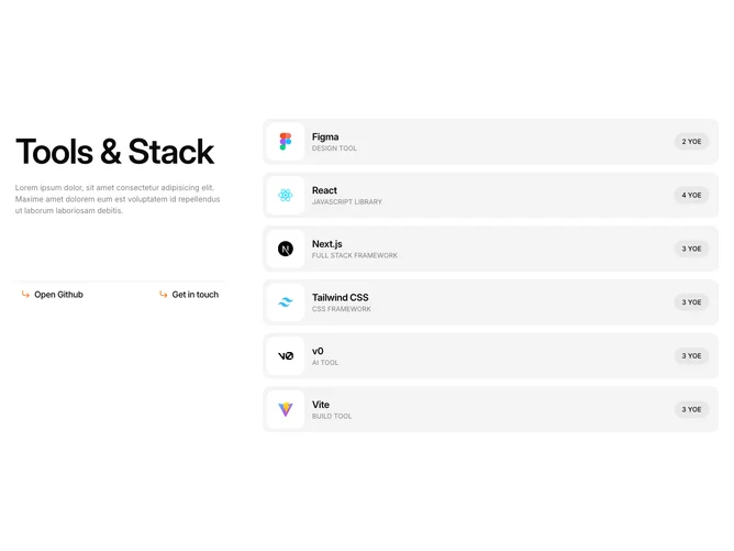
A component featuring a compilation of professional tools and frameworks, with a 6-column layout, displaying items in a 2:4 ratio. It highlights each tool's name, category, experience, and logo. Unique features include customizable buttons and a sticky left column with introductory text and navigation options.
This component provides a reusable UI element for your application.