
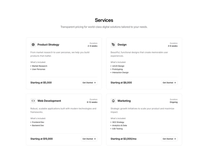
Services 9 block design & features
A centered heading and subtitle introduce four service cards arranged in a two-column grid. Each card is a bordered rounded container with a header row pairing an icon in a muted square with a title on the left and a duration label on the right. Below, a description paragraph is followed by a "What's included" label and a dot-prefixed item list. A bottom border separates the content from a footer row containing the price and a shadcn/ui outline Button with an arrow icon.
Cards gain a larger shadow on hover, providing a lift effect. Icons sit inside small rounded-lg muted containers at the top of each card. The footer section uses a top border to visually anchor the pricing information, with the semibold price on the left and the compact button on the right.
The structure is information-rich but orderly, layering title, description, inclusions, and pricing into distinct vertical zones within each card. The bordered card treatment and hover shadow keep the design grounded and professional.
On smaller screens the two-column grid collapses to a single column, with cards stacking vertically and retaining their full internal layout.