
Services 8 block design & features
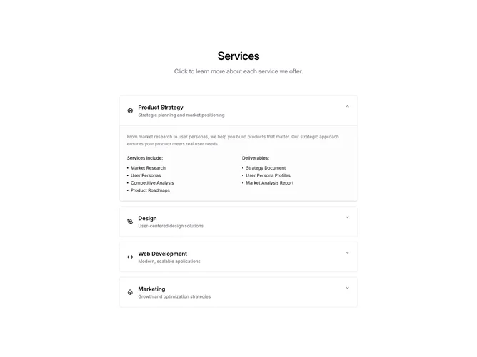
A centered heading and subtitle introduce a shadcn/ui Accordion in single-open collapsible mode, with the first item open by default. Each AccordionItem is wrapped in a bordered rounded container. The trigger row displays an icon, a semibold title, and a muted subtitle. Expanded content shows a description paragraph followed by a two-column grid splitting "Services Include" and "Deliverables" lists, each using dot-prefixed entries.
Trigger rows gain a muted background tint on hover, and expanded panels receive a subtle muted background with top and bottom borders to visually separate them from the trigger. Icons are rendered at 20px alongside the text, and the overall container is constrained to a narrow max-width for comfortable reading.
The accordion structure keeps the section compact while offering rich detail on demand. The two-column split inside each panel provides a clear distinction between what is performed and what is delivered, adding informational depth without cluttering the collapsed view.
The single-column layout is maintained across all breakpoints, with the inner two-column grid stacking on the smallest viewports.