Services 5 block design & features
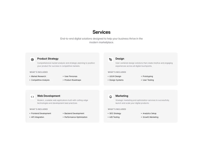
A centered heading and subtitle sit above a two-column grid of four service cards. Each card uses a muted background fill with rounded corners and holds an icon inside a bordered background container alongside a title and short description. Below, an uppercase "What's Included" label introduces a two-column grid of dot-prefixed items. No Shadcn UI component imports are used.
Icons sit inside small bordered containers with a background fill, creating a layered look against the muted card surface. Descriptions appear in a smaller size with relaxed leading, while item labels use the default foreground color at a small size. The uppercase section label adds structural rhythm between the descriptive text and the inclusion list.
The cards read as self-contained information blocks with a soft, low-contrast appearance. The muted fills and absence of borders or shadows give the section a quiet, understated tone that prioritizes content scanning over visual flair.
On narrower screens the grid reduces to a single column, and the included-items grid within each card retains its two-column layout for density.