

Services 21 block design & features
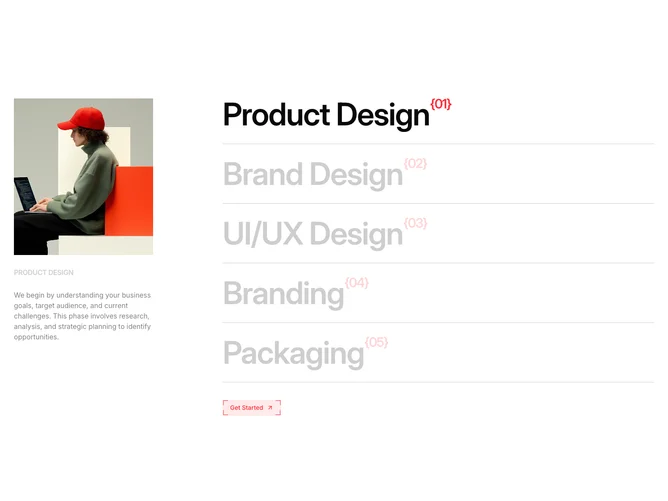
The section splits into two columns. The left column is sticky and contains a tall image preview area, an uppercase title label, and a paragraph of description text. The right column lists five service titles in very large semibold type, separated by foreground-colored bottom borders. Each title carries a red superscript identifier in curly braces. A BorderButton with a red accent sits below the list.
Hovering a title on the right updates the left column's image with a clip-path wipe animation powered by Framer Motion, revealing the new image from left to right. Non-active titles dim to 20% opacity, creating strong focus on the hovered item. The previous image remains visible beneath the incoming one during the transition.
The design has an agency-portfolio character, with the oversized type and red accents lending a bold, directional feel. The sticky left panel ensures the image context remains visible while scrolling through the title list.
On smaller viewports the sticky behavior is removed and the two columns stack, with the image preview and description appearing above the service list.