
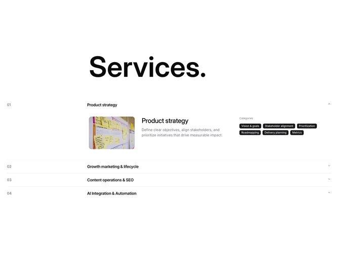
Services 16 block design & features
The section opens with a massive "Services." heading spanning three of four grid columns, set at a fluid size that scales from 6xl up to 9xl. Below it, a shadcn/ui Accordion in multi-open mode lists four service items. Each trigger row displays a zero-padded index number and a semibold title in a four-column grid alignment. Expanded content reveals a landscape image, a repeated larger title with description, and a cluster of Badge components labeled as categories.
Trigger rows use muted-foreground index numbers for a clean typographic counter effect. Inside each expanded panel, the image sits at a fixed width with rounded corners, while the description and badge cluster occupy the remaining columns. Badges use the default filled variant, keeping them visually prominent against the content area.
The overall character is editorial and restrained, with the oversized heading establishing strong visual weight at the top. The accordion structure keeps the section compact when collapsed, revealing rich detail only on interaction.
On narrow viewports the four-column grid flattens, stacking the index number above the title in the trigger and placing the image above the text and badges in the expanded content.