Services 14 block design & features
The Services14 component is a visually engaging section that showcases various services offered by a business, using a grid-based layout. It leverages dynamic motion and visual effects to highlight each service, providing users with a seamless exploration experience. This component effectively communicates the offerings of a company and encourages users to engage further through intuitive design elements like hover effects and interactive buttons.
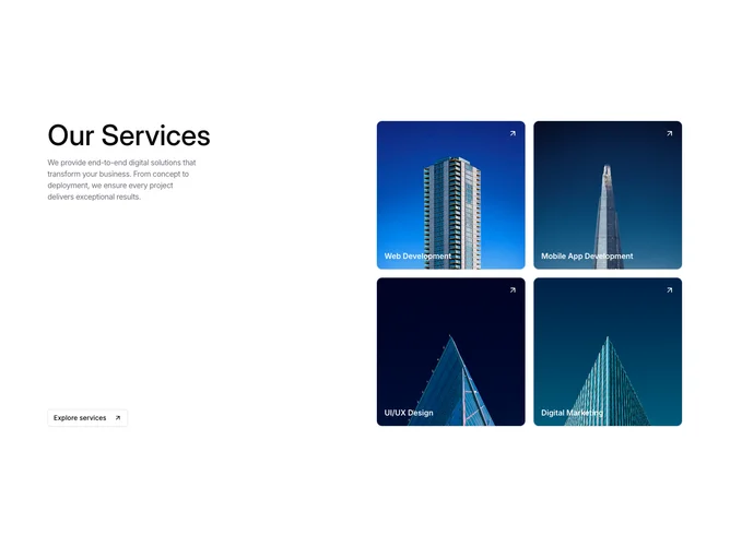
At its core, Services14 organizes services into a grid with large, eye-catching images and titles. The component begins with a headline and a brief introduction that sets the context for what the services aim to provide. Each service is displayed in a card format, offering engaging user experience through interactive animations and transitions. The section is equipped with a call-to-action button, inviting users to explore detailed descriptions of the services offered. Through the use of shadcn ui, Services14 achieves an aesthetically pleasing balance between text and visuals, embodying a modern web design approach with clear calls to action.