Service 6 block design & features
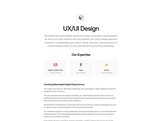
Service6 is a centered single-column service detail block. The page opens with a centered icon in a muted container, a large centered heading, and a supporting paragraph. Below is a three-column expertise grid showing tool logos with names and descriptions in muted rounded cards. The main prose section contains headings, paragraphs, and a service list using Lucide icons paired with text. The page closes with a centered "Related Services" heading and a two-column grid of linked service cards.
Expertise cards are center-aligned with icons at 32px and text below. Service list items use icon-text flex rows with primary-colored icons. Related service cards have muted backgrounds with hover transitions that highlight text and icons in the primary color. The entire layout is constrained to a narrow max-width for focused reading. Built with shadcn/ui color and spacing tokens.
The centered layout gives the page a presentation-style feel distinct from sidebar-based layouts. Multiple clearly delineated sections provide structure without complexity. The expertise grid, icon-annotated services, and related services grid add variety to what is otherwise a text-heavy page. Moderate complexity.
On mobile the expertise grid and related services grid each collapse to single columns while maintaining their visual treatment.