

Reviews 26 block design & features
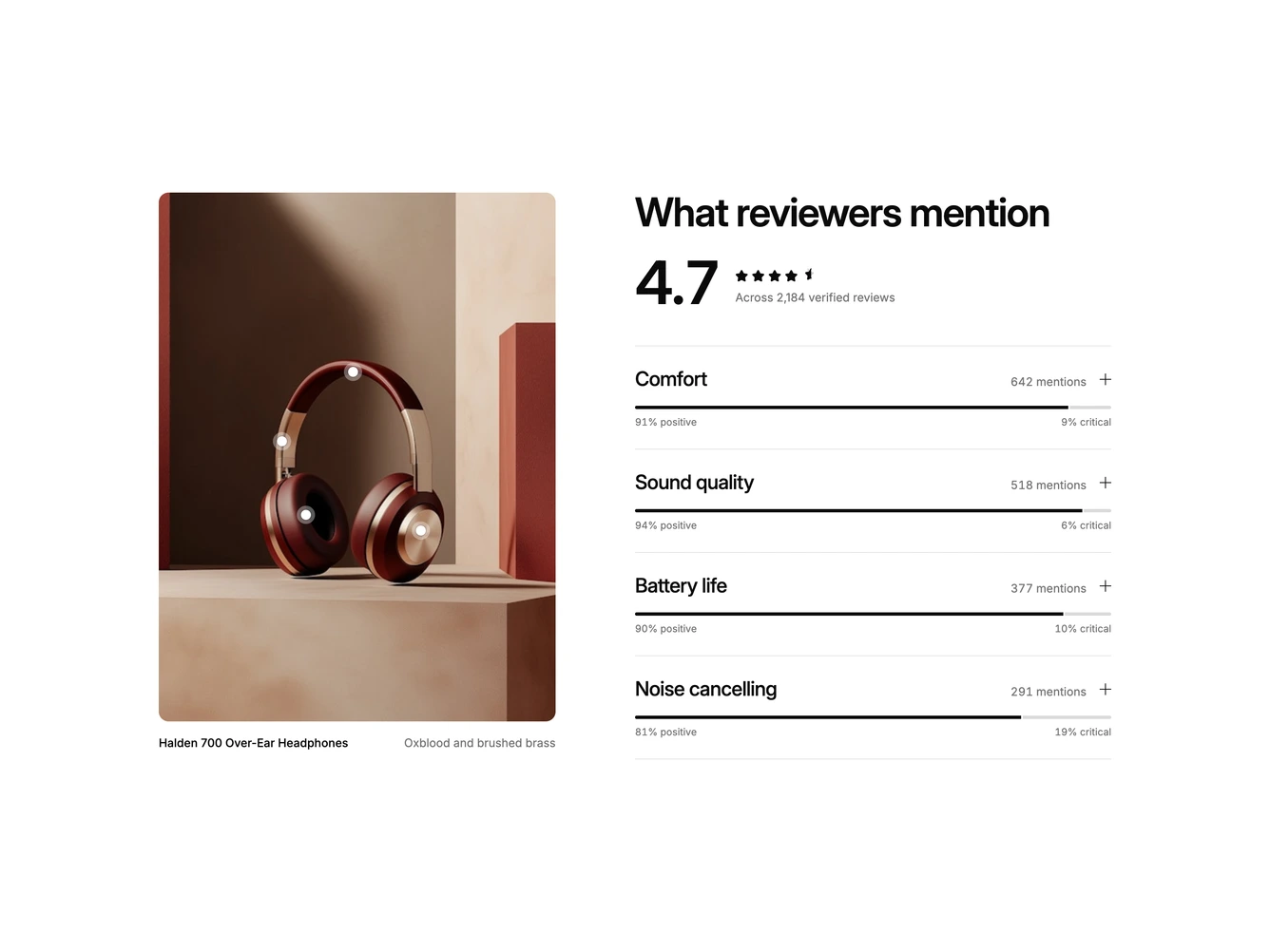
A review topics section built with shadcn/ui. A tall photo of oxblood and brass over-ear headphones sits in a sticky column with small pins marking the parts reviewers talk about, such as the ear cushions, the driver and the headband. Beside it, a large heading and an oversized 4.7 average with its star row and review count lead into a list of topics, each with its mention count and a thin split bar showing the share of positive and critical mentions.
Opening a topic expands it smoothly to a one-line summary and two columns of quotes, praised and critical, each column headed by its review count and each quote with the key phrase marked in a soft highlighter, the reviewer's name and their stars. At the same time the matching pin on the photo grows its ring and shows a small label with the topic and its positive share, while the other pins fade back. Simply hovering a topic title lights its pin and label the same way, and hovering a pin works in reverse. The pins open the same topics, only one topic is open at a time, and a plus mark turns into a minus on the open row. Motion is turned off when reduced motion is preferred.
The result is an editorial, typography-led summary that connects what people say to the part of the product they are talking about, a richer pattern than a plain review feed. It is moderately complex and content-driven, needing one product photo, pin positions for each topic and quotes tagged as positive or critical with the phrase to highlight. On mobile the photo sits above the topic list.