

Reviews 25 block design & features
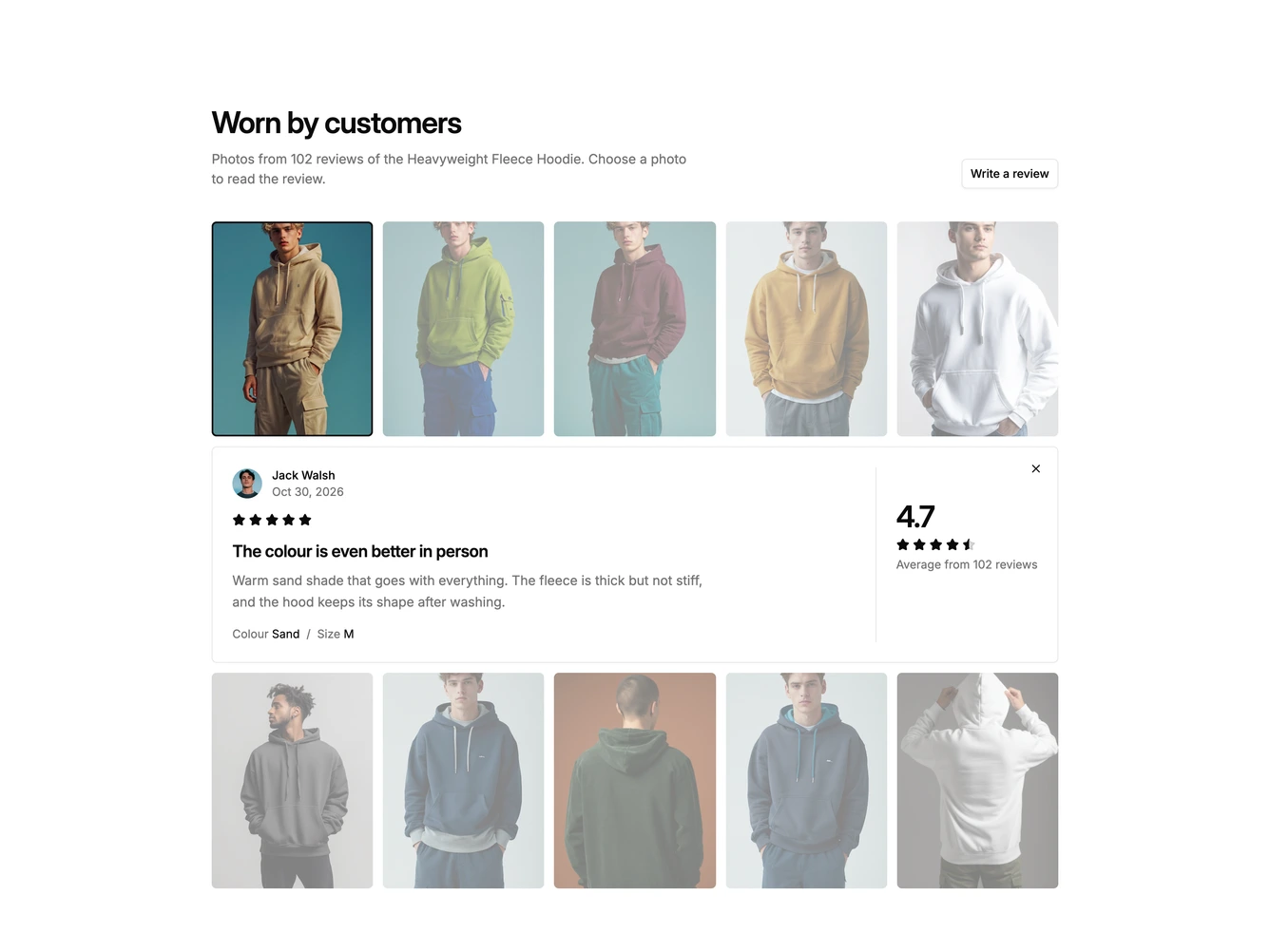
A customer photo review wall made with Shadcn UI. A heading, a short description and a Write a review button sit above a grid of portrait-format customer photos showing the same hoodie in different colours. The first review is open when the block loads. Choosing a photo opens a full-width panel directly below that row with the reviewer's avatar, name and date, a star rating, a review title and text, and the colour and size they bought.
The panel opens by animating its height, and the other photos fade back while the chosen one gains an outline. Picking another photo in the same row swaps the review in place, picking one in a different row closes the first panel as the new one opens, and the close button, the photo itself or the Escape key closes it again. The styling is flat and neutral with rounded photos, a hairline bordered panel and no decoration beyond the photography. Animations are disabled when reduced motion is preferred.
The block feels like a social, photo-led storefront section in the style of an image search results page, a less common take on review lists. It is moderately complex and image-driven, needing several customer photos with matching reviews. The grid shows two columns on mobile, three on tablets and five on desktop, and the panel always opens below the row of the chosen photo at every width.