
Reviews 24 block design & features
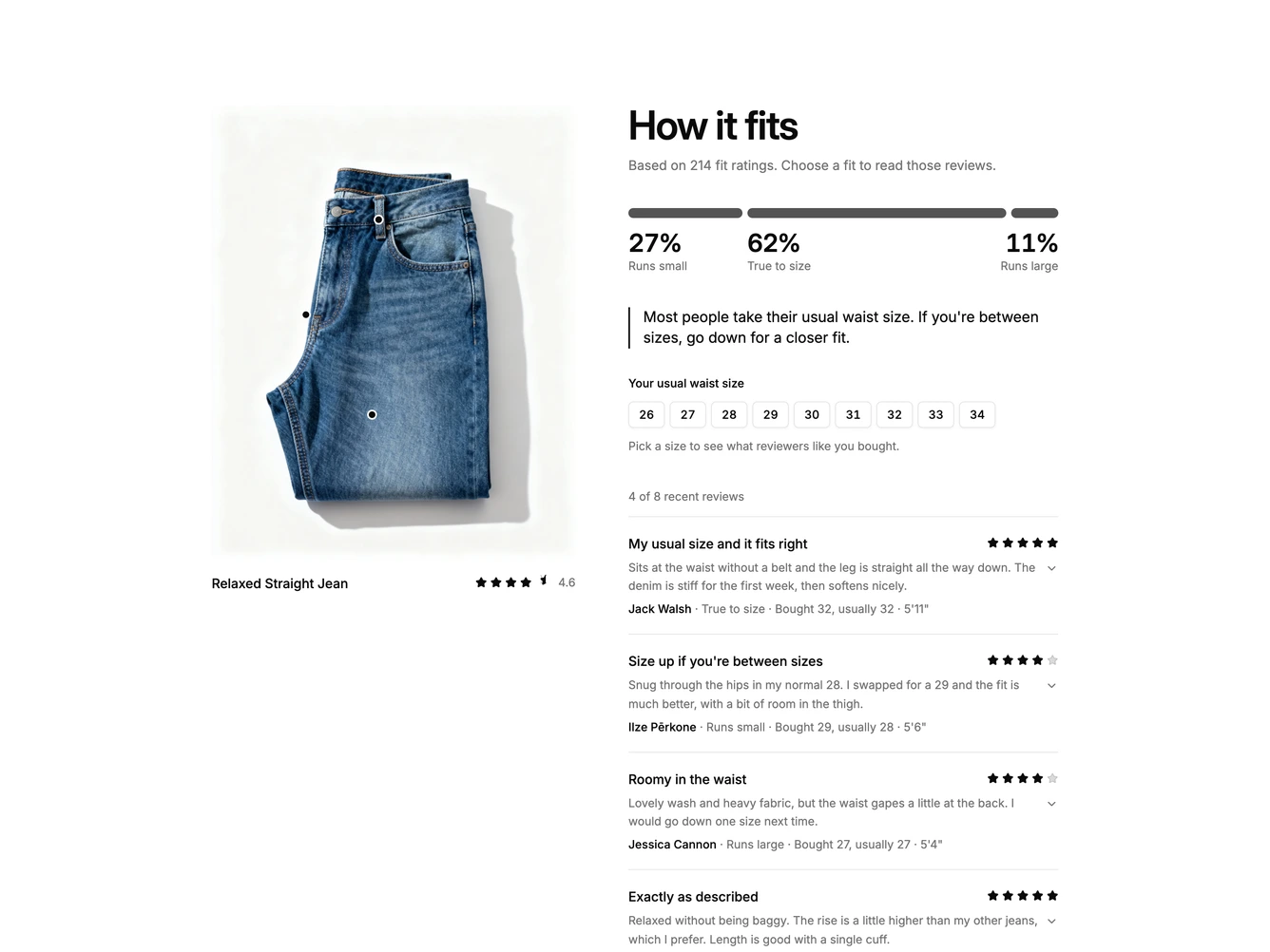
A fit-focused review section built with shadcn/ui. A large product photo sits on the left with the product name and average rating beneath it. On the right, a bold How it fits heading and a line stating how many fit ratings the summary draws on lead into a single segmented bar. Its three segments, Runs small, True to size and Runs large, are sized by their share of ratings and carry the percentage and label underneath. A size advice line follows, then a compact list of the four most recent reviews, each with a title, star rating, two-line excerpt and one line naming the reviewer, their fit verdict, the size they bought against their usual size, and their height.
Each segment is a filter button. Choosing one darkens it while the others fade back, rewrites the size advice for that fit, and fades in a short note pinned to the relevant spot on the photo, such as snug through the thigh or can gape at the back waist. Reviews that do not match collapse smoothly out of the list while matching ones slide in, a status line reports the count, and a Show all button returns to the unfiltered list. Pressing the active segment again also clears it. The list keeps its height so the page does not jump, and motion is skipped when reduced motion is preferred.
The block suits apparel and footwear product pages where sizing confidence matters more than star scores. It is moderately complex and content-driven, needing a product photo, fit counts across all reviews, advice per fit, photo note positions and reviews tagged with a fit verdict and sizing details. On mobile the photo stacks above the summary and the list follows in a single column.