Resources 2 block design & features
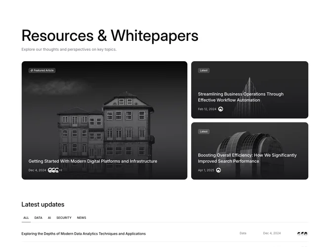
The Resources2 shadcn block provides a visually compelling way to display and navigate through a collection of resources and whitepapers. It features a dynamic layout that adjusts the presentation based on category selection, ensuring that users can focus on content relevant to their interests. The component incorporates striking visual elements such as transition effects and gradient overlays, enhancing user interaction by highlighting featured articles prominently.
In a layout that blends functionality with aesthetic appeal, the Resources2 shadcn component delivers an engaging display of articles across different categories like Data, AI, Security, and News. Using a combination of selectable tabs and interactive cards, it facilitates easy browsing and quick access to articles. Each article card provides pertinent details such as the title, category, publication date, and contributing authors with avatars, promoting a rich and informative browsing experience. The component's design leverages shadcn ui to differentiate between featured and latest articles, employing badges for effective categorization.