
Projects 30 block design & features
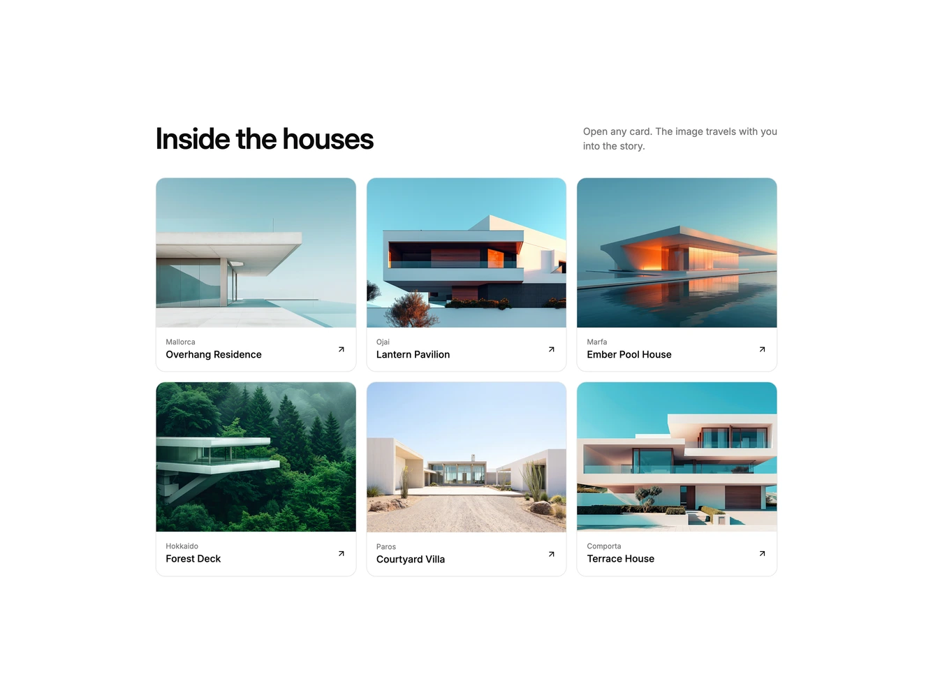
Projects30 uses shared element transitions to open stories. This shadcn/ui block shows a heading and short description above a three-column grid of bordered cards, each with a 4:3 photo, a location label, a title, and an arrow.
Clicking a card does not open a separate modal. The card itself grows into a large centered dialog: the photo stretches into a wide 16:9 header, the title and label move into place, and the description and button fade in just after. Closing reverses the motion back into the grid, and the page behind is dimmed and blurred while the story is open. Escape, the close button, and a backdrop click all close it.
The block feels fluid and app-like, a polished alternative to a lightbox for case studies, articles, or property listings. It needs a landscape photo, label, title, and a short paragraph for each story.
The grid drops to two columns and then one on smaller screens.