
Projects 17 B block design & features
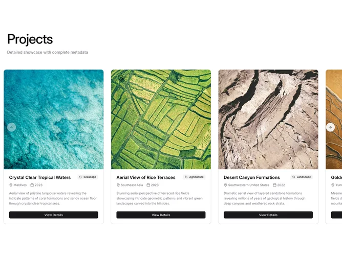
This variant presents project data inside fully structured cards within a Shadcn UI Carousel. Each card has a bordered container with a square image at the top (with hover scale), followed by a content area containing the title, a secondary Badge with a tag icon for category, location and year with map-pin and calendar icons, a paragraph description, and a full-width "View Details" button.
The card approach packs significantly more metadata per item than the image-focused siblings. Navigation arrows with shadow styling flank the carousel at vertical center. The heading and subtitle above establish context.
Visually the cards follow a standard shadcn/ui card pattern with border, background, and shadow. The dense information layout suits scenarios where project context matters as much as the imagery. Typography is semibold for titles and relaxed leading for descriptions.
On mobile each card fills nearly the full viewport width, and the carousel supports drag-free touch interaction.