
Projects 16 block design & features
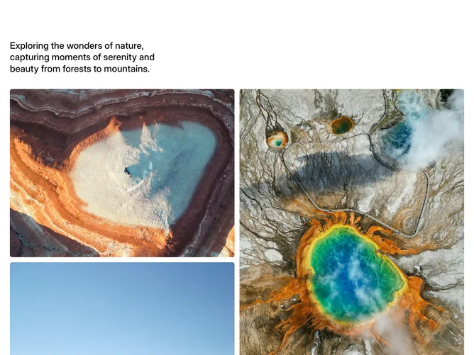
The section opens with a multi-line heading in medium weight, followed by a two-column image grid containing four photos. The left column stacks a landscape (4:3) image above a portrait (4:5) image, while the right column reverses the order, creating an interlocking visual rhythm. Below the grid, a short paragraph of muted text and a Shadcn UI link-style Button with an arrow round out the composition.
All images use rounded corners and full-width object-cover sizing within their aspect containers. The alternating tall and wide proportions prevent monotony and introduce vertical movement across the two columns. Spacing between the images is consistent and tight.
The mood is quiet and editorial, letting nature photography carry the visual weight while typography remains secondary. There is no animation or hover interaction, producing a completely static, print-inspired layout.
On mobile the two-column grid stacks to a single column, maintaining the alternating aspect ratios in sequence.