Projects 15 block design & features
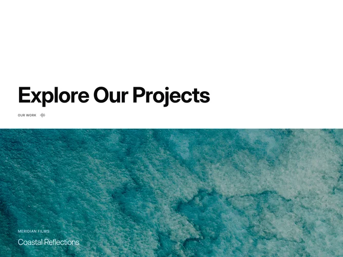
The component occupies viewport height and splits into a header area and a series of stacked video panels. The header displays a large bold heading and a small uppercase label with an audio icon. Below, each video section fills the full width at half-viewport height, showing a static thumbnail image by default.
When a user hovers a panel, the thumbnail fades out and a looping muted video fades in through an opacity crossfade lasting 700 milliseconds. A semi-transparent dark overlay sits above the media, lightening slightly on hover. Text overlays at the bottom-left show the studio name in small uppercase and the project title in light-weight large type.
The mood is cinematic and immersive, relying on full-bleed imagery, restrained white text, and the surprise of motion to create engagement. The layout is linear and scroll-driven with no lateral navigation.
The panels stack vertically at all breakpoints, with text sizes scaling down on smaller screens.