
Projects 13 block design & features
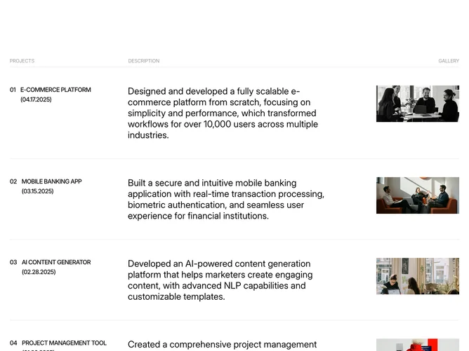
The section organizes project entries in a vertical list separated by bottom borders. Each row splits into three zones on desktop: a left column showing the project number, title, and launch date in uppercase tracking; a center column containing a large-text description; and a right column holding a small thumbnail image.
Typography drives the visual hierarchy. The description text is rendered at a significantly larger size than surrounding metadata, making it the focal point of each row. Numbers and dates use tight tracking and medium weight, while the overall typeface treatment leans editorial and typographic.
The aesthetic is structured and data-forward, resembling a case-study index or annual report listing. There are no hover effects, animations, or interactive elements, keeping the presentation static and print-inspired.
On narrower screens the three-zone row collapses to a stacked vertical arrangement, maintaining the border separators between entries.