
Project 6 block design & features
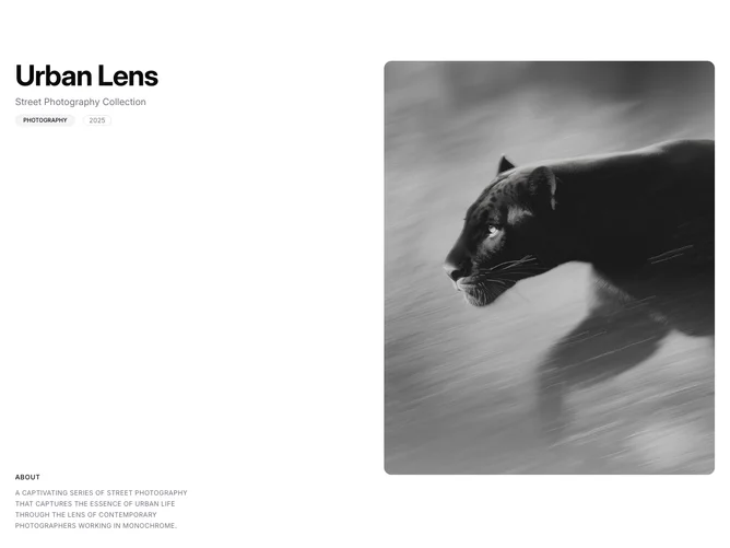
The block splits into two equal columns. The left column is sticky and contains a bold title, a subtitle, a shadcn/ui Badge for the category, a year label in a bordered pill, and an uppercase "About" section with a description paragraph pinned to the bottom. The right column holds four vertically stacked portrait images at a 4:5 aspect ratio, each in a rounded container with a gradient overlay. Images scale on hover and display a muted overlay that fades in. Below the two-column section, a "More Collections" heading introduces three project cards in a three-column grid, each showing a 4:3 image with a category Badge overlay and a title.
Images animate into view individually with staggered scroll-triggered fade-in transitions. Project cards use full overlay dimming that lightens on hover, with the category Badge and title positioned at top-left and bottom-left. The sticky sidebar spans the full viewport height and distributes its content between top and bottom.
The aesthetic is monochrome and gallery-forward, with large portrait images dominating the right column. The "More Collections" cards provide navigation to related sets. Built with Shadcn UI Badge and layout tokens.
On smaller screens the two-column layout stacks vertically, the sticky behavior is removed, and the project card grid reduces to a single column.