
Project 2 C block design & features
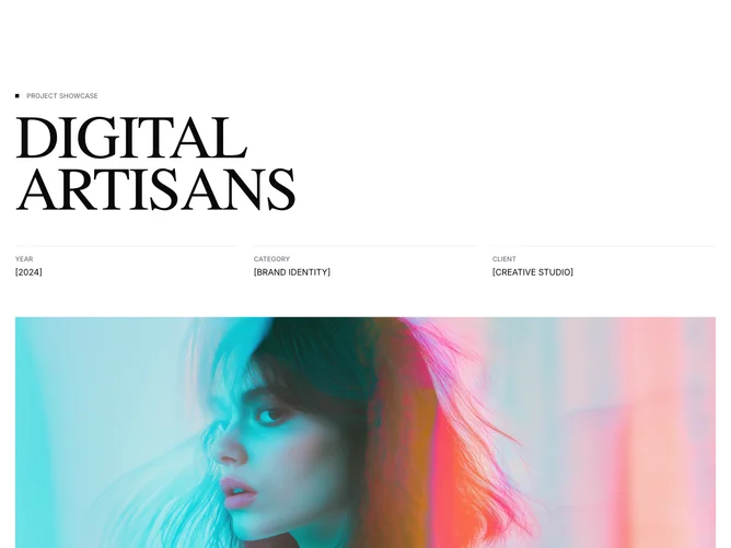
The layout begins with a small square dot paired with a "Project Showcase" label, followed by a large serif title. A three-column metadata row shows year, category, and client, each preceded by a full-width top border line. A 16:9 aspect image with an optional caption sits below. The description section uses a two-column arrangement on large screens, with a sticky left column holding a dot-prefixed overview heading and the right column containing a large light-weight summary, a body paragraph, and a Shadcn UI outline Button.
The dot indicators appear twice: once as a small foreground square in the project label and again as a larger square next to the overview heading. Metadata columns use a thin top border that spans the full column width, creating a ruler effect. The serif title scales up to 9xl with tight leading. The sticky overview heading remains visible as users scroll through the longer description column.
The aesthetic is refined and editorial, using geometric dot accents and ruled lines to add structure without heaviness. All content fields are prop-driven.
On mobile the three-column metadata stacks, and the two-column description section collapses to a single flow.