
Products Bundle Hotspot 5 block design & features
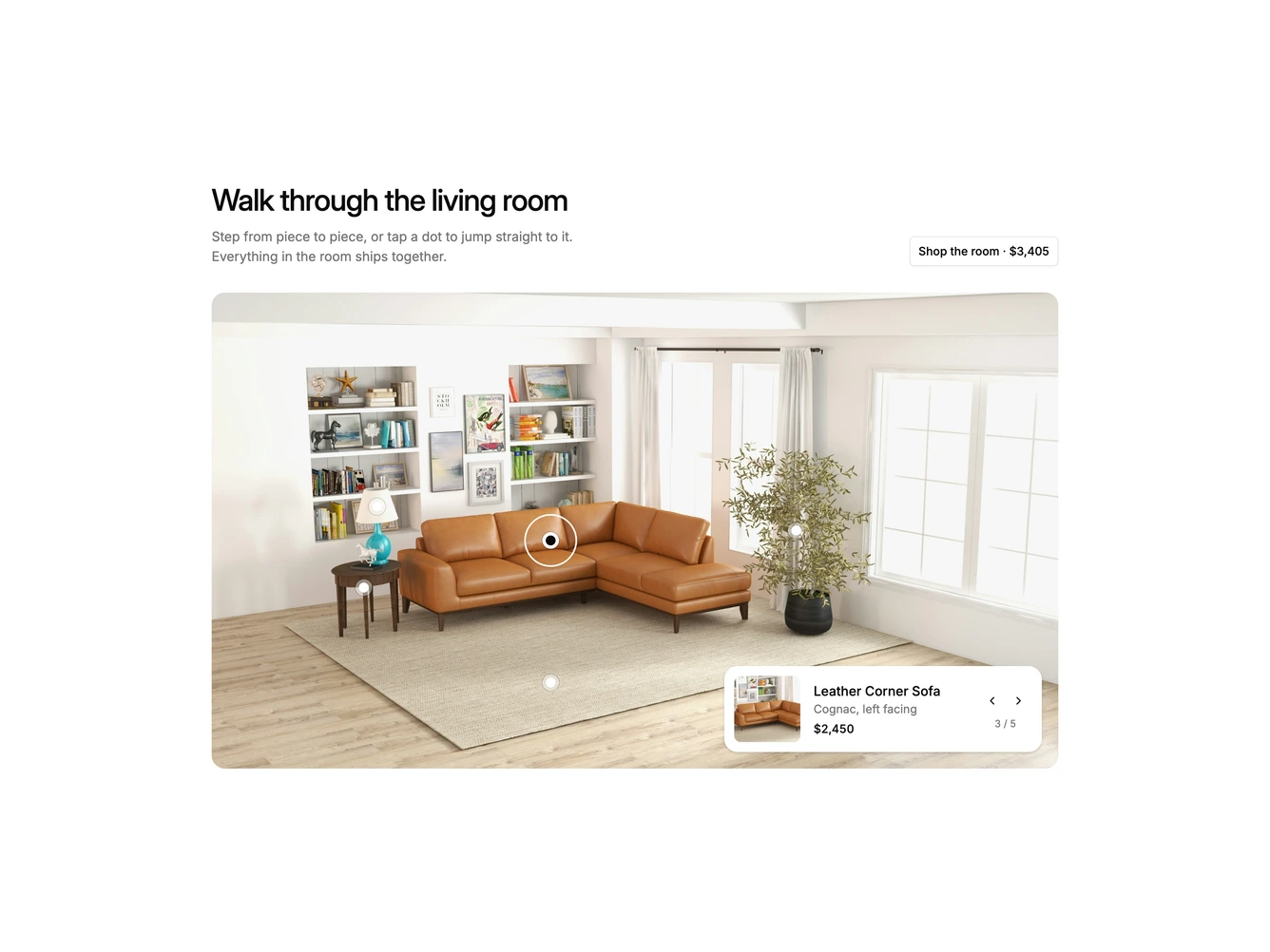
ProductsBundleHotspot5 is a wide shadcn/ui room section with a heading, description and outlined shop the room button above a large landscape photo of a living room. Small dots mark the lamp, side table, corner sofa, rug and olive tree, and a white ring circles the piece currently in focus. A product card docked in the corner of the photo shows a square close-up cropped from the photo itself, the piece name, its detail, its price, previous and next buttons, and a position counter.
Stepping forward or back, pressing the arrow keys, or tapping any dot moves the ring smoothly across the room to the next piece while the card's close-up and text fade to match. The rest of the design stays out of the way, with a white card, a soft shadow and plain type over the photography.
It feels guided and unhurried, like a sales assistant walking you around a showroom, which sets it apart from pins that open popovers. The block is moderately complex but needs very little content because the close-ups come from the same photo. It requires one landscape room photo plus a name, detail, price, pin position and crop zoom for each piece. On small screens the card moves below the photo while the ring and dots stay on the image.