

Products Bundle Hotspot 3 block design & features
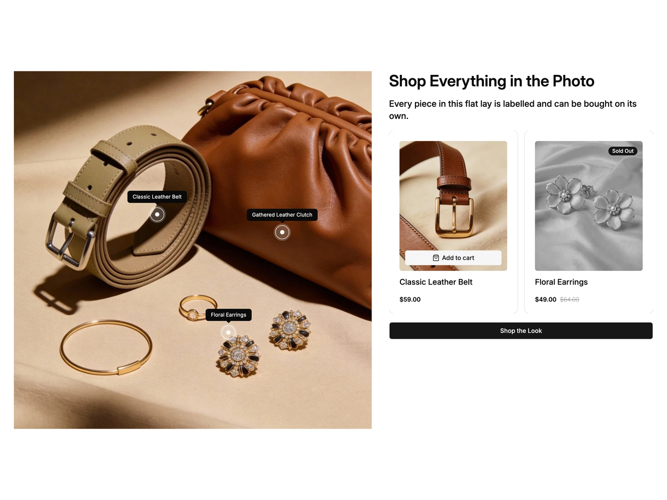
A shadcn/ui shop-the-look section built around a square flat lay photo of accessories. On desktop each item in the photo has a ringed hotspot with its name shown permanently in a small dark label. To the right sit a heading, a short description, a carousel of product cards and a full-width Shop the Look button. Hovering or focusing a hotspot fills its ring, scrolls the carousel to that product's card and fades the other cards. Hovering a card does the same for its hotspot.
Each product card has a photo, name and price, with an Add to cart button over the image. Sold out products are shown in grayscale with a Sold Out badge and no cart button. The products, hotspot positions, stock status, heading and image are props.
On mobile the product carousel is hidden. Tapping a hotspot opens a bottom drawer with that product's photo, name, price and Add to Cart and Quick View buttons, and the cart button is disabled when the item is sold out.