

Products Bundle Hotspot 2 block design & features
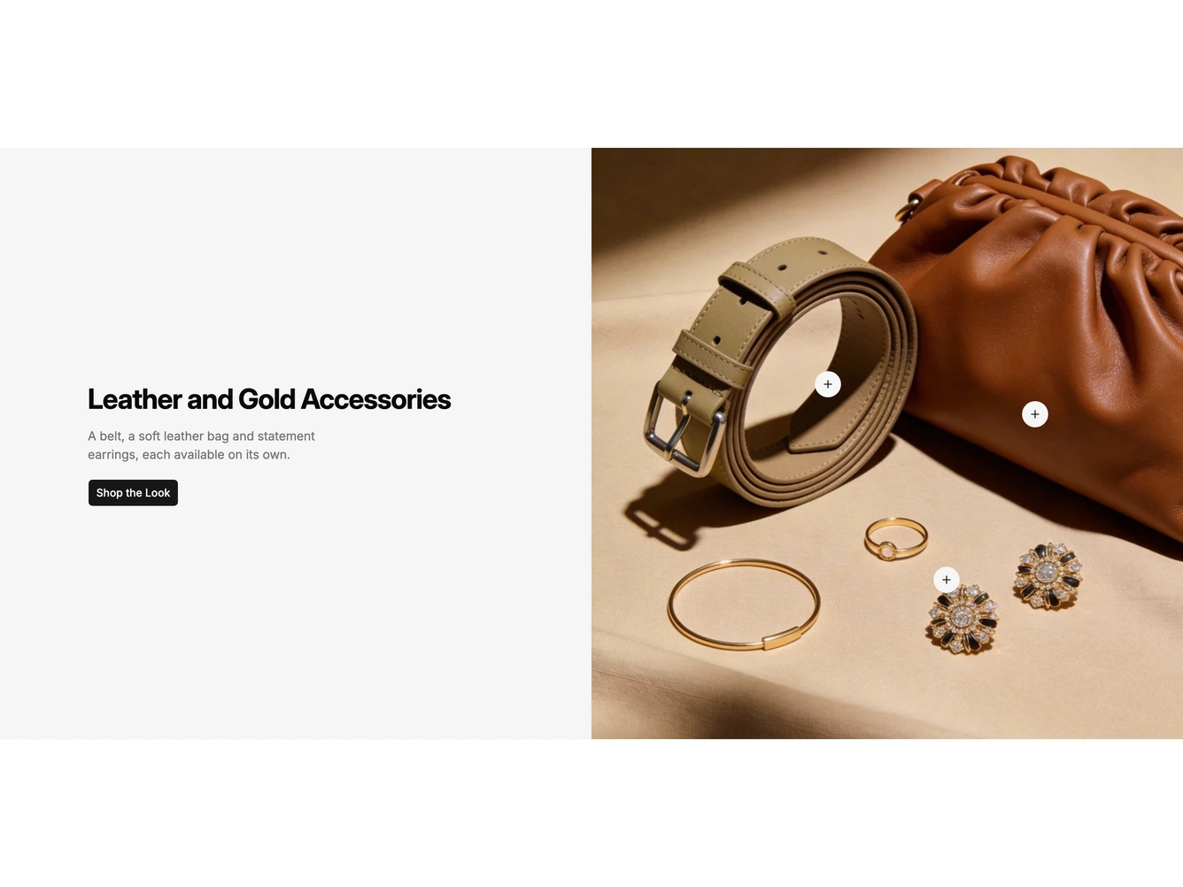
A two-column shadcn/ui section for an accessories bundle. On the left, a muted panel holds a bold heading, a one-line description and a Shop the Look button. On the right, a flat lay photo of a belt, a leather clutch and gold jewelry carries round plus buttons over each item.
Tapping or hovering a plus button opens a floating product card beside it with a thumbnail, category, name, a colored stock status line such as Next day delivery or Out of stock, the price with a Sale badge when discounted, and a View product button. The products, their hotspot positions, stock status, heading, description, button, image and whether cards also open on hover are props.
On mobile the photo stacks above the text, and the product cards open with a tap.