Product Gallery 30 block design & features
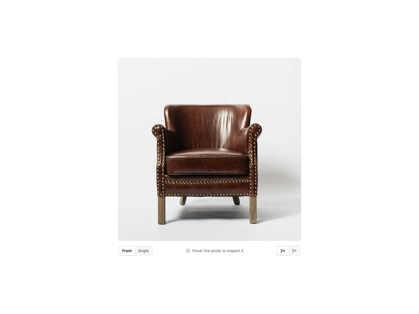
A single square product gallery built with shadcn/ui conventions, showing a leather club chair on a soft studio backdrop. Moving the pointer over the photo brings up a round lens that tracks it and shows that spot enlarged from a larger source file, so stitching, studs and leather grain can be read without leaving the page. Underneath sit a segmented toggle for switching between the front and three-quarter photos, a short hint line, and a second segmented toggle for two or three times magnification.
The styling is restrained: a rounded muted frame, a white-rimmed lens with a light shadow, and small pill-shaped segmented controls whose active option lifts onto the background colour. The main photo never moves or scales; only the separate lens fades in and out, and switching photos crossfades between them. The lens can also be driven from the keyboard with the arrow keys once the photo has focus, and Escape hides it.
This is a focused, practical take on the classic retail magnifier, closer to a detail inspection tool than a carousel. It needs one or more square product photos, ideally each with a larger version for the lens, and the views, magnification levels and lens size are all props. On touch screens dragging a finger across the photo moves the lens.