
Product Gallery 10 block design & features
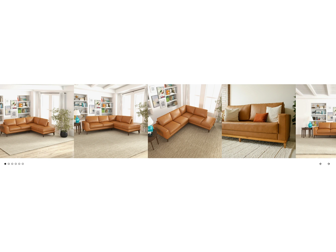
A full-width product image strip built with shadcn/ui Carousel. On desktop several square photos sit side by side and the last one is cut off at the right edge, hinting that there is more to see. On small screens it shows one photo at a time.
Below the strip, a row of small dot indicators sits on the left and a pair of ghost arrow buttons sits on the right. The carousel loops, so the arrows keep cycling, and clicking a dot jumps straight to that image. On desktop the dots are only shown when there are six or more images.
The images are passed in as a prop, each with a srcset, sizes and alt text.