

Product Detail 30 block design & features
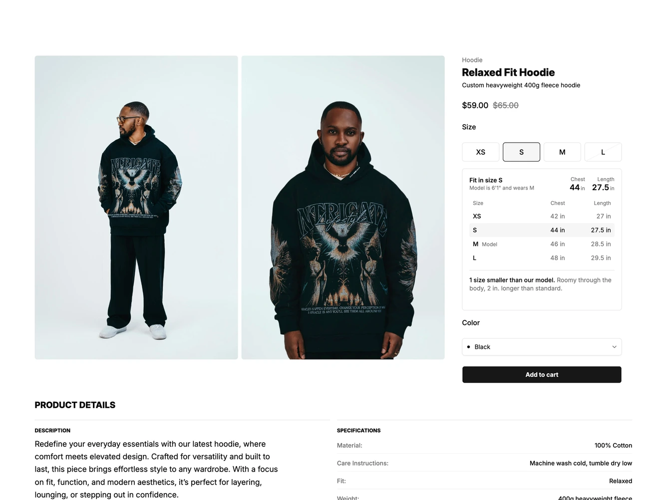
A clothing product page built with shadcn/ui. Front and side photos sit in a two-column grid that opens in a PhotoSwipe lightbox, and a sticky buy box on the right holds the name, sale price, size pills, a color select and an add to cart button. Product details and a specifications list follow underneath.
Directly under the size pills, a fit panel shows the model's height and the size they wear, the chest and length of the chosen size, and a small measurement table for every size. Choosing a size slides a shared highlight between the pills and, with a spring, between table rows. The chest and length figures tick to their new values and a comparison note crossfades in with a short vertical offset.
Sizes, measurements, notes and the model details live in the data object, so a new garment only needs a new fit array. Motion respects reduced motion settings. On mobile the photos stack above the buy box and the size pills fill a four-column row.