
Product Detail 24 block design & features
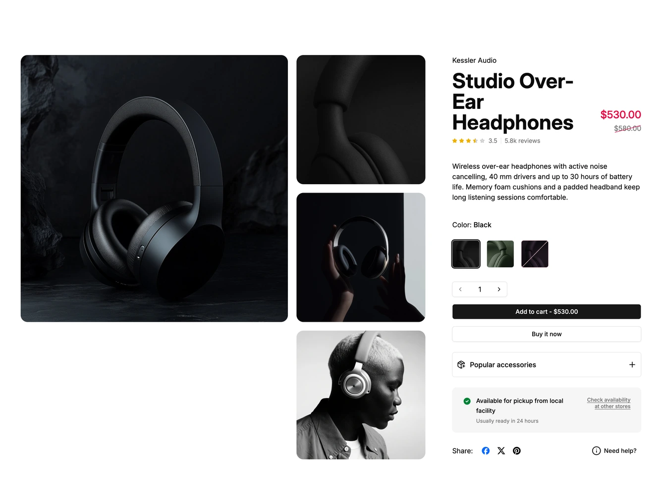
The block is a headphones product page built with shadcn/ui. A large photo sits beside a column of four smaller ones, and the right column opens with the brand, the product name, a red sale price and a compact star rating with the review count.
After a short description, the color options are square photo tiles with the color name in a tooltip, where sold-out colors are outlined and crossed in rose, and a stock status message updates with the chosen color. A quantity stepper, an add to cart button showing the total, and an outline buy now button follow, then a collapsible popular accessories panel, a pickup availability card and share icons.
The accessories panel expands in place, with its plus icon switching to a minus while open. When the main buttons scroll out of view, a compact bar with the name, price and add to cart slides in at the bottom. Images open in a PhotoSwipe lightbox, and on mobile the mosaic becomes a carousel with dots.