
Product Detail 15 block design & features
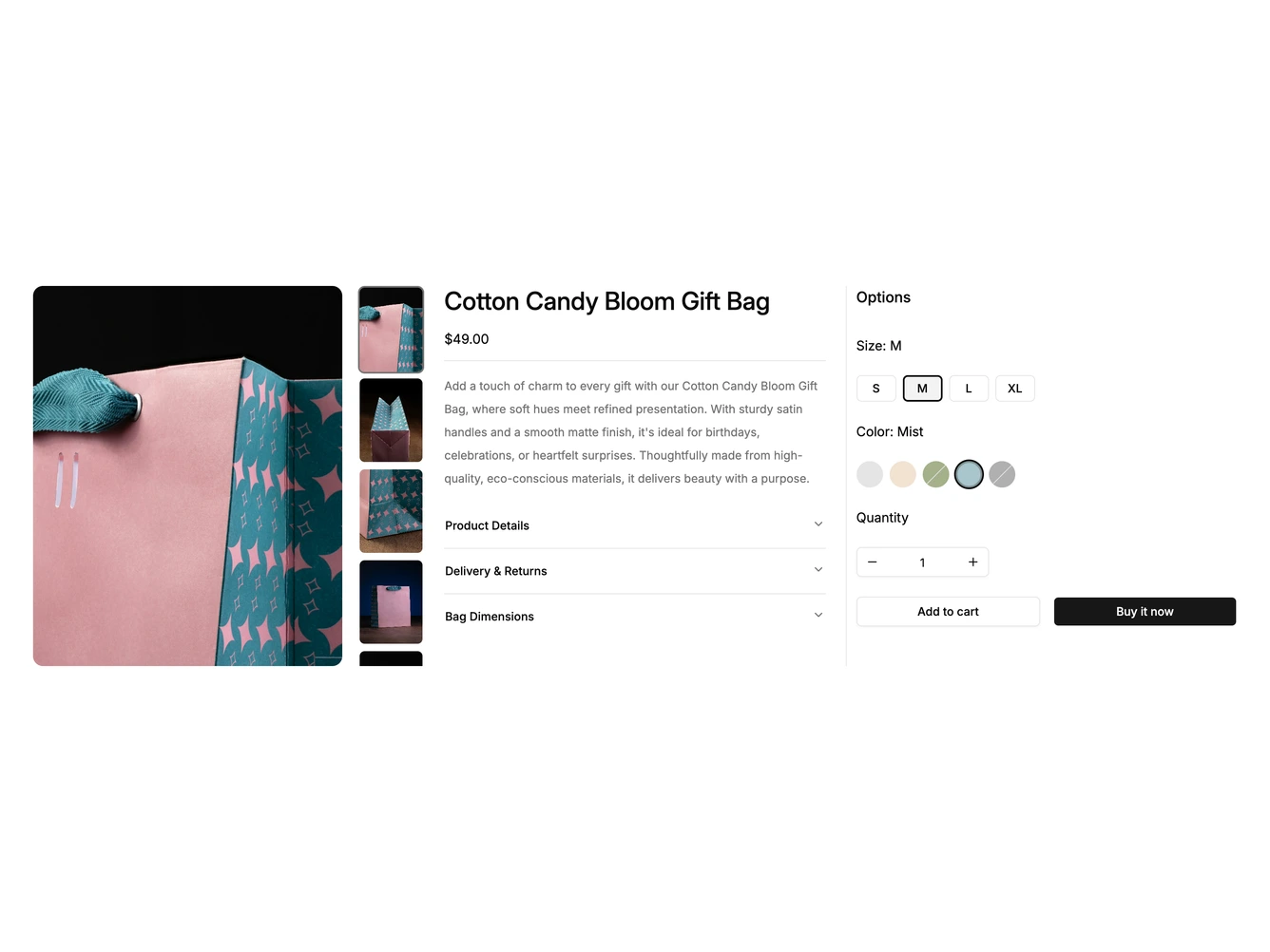
The block splits a product page into three columns, built with shadcn/ui. A large photo and a vertical thumbnail rail come first, then the product name, price, description and an accordion covering product details, delivery and returns, and bag dimensions.
A separate options panel on the right, set off by a hairline, holds compact size buttons, round color swatches, a quantity stepper and side-by-side add to cart and buy now buttons. The chosen size and color are named next to their labels.
Hovering a swatch shows the color name in a tooltip, and out-of-stock colors carry a diagonal line. The thumbnails drive the main image and any photo opens in a PhotoSwipe lightbox. On tablets the description and options share a second column. On mobile everything stacks, the thumbnail rail is hidden and arrow buttons appear under the photo.