
Product Detail 11 block design & features
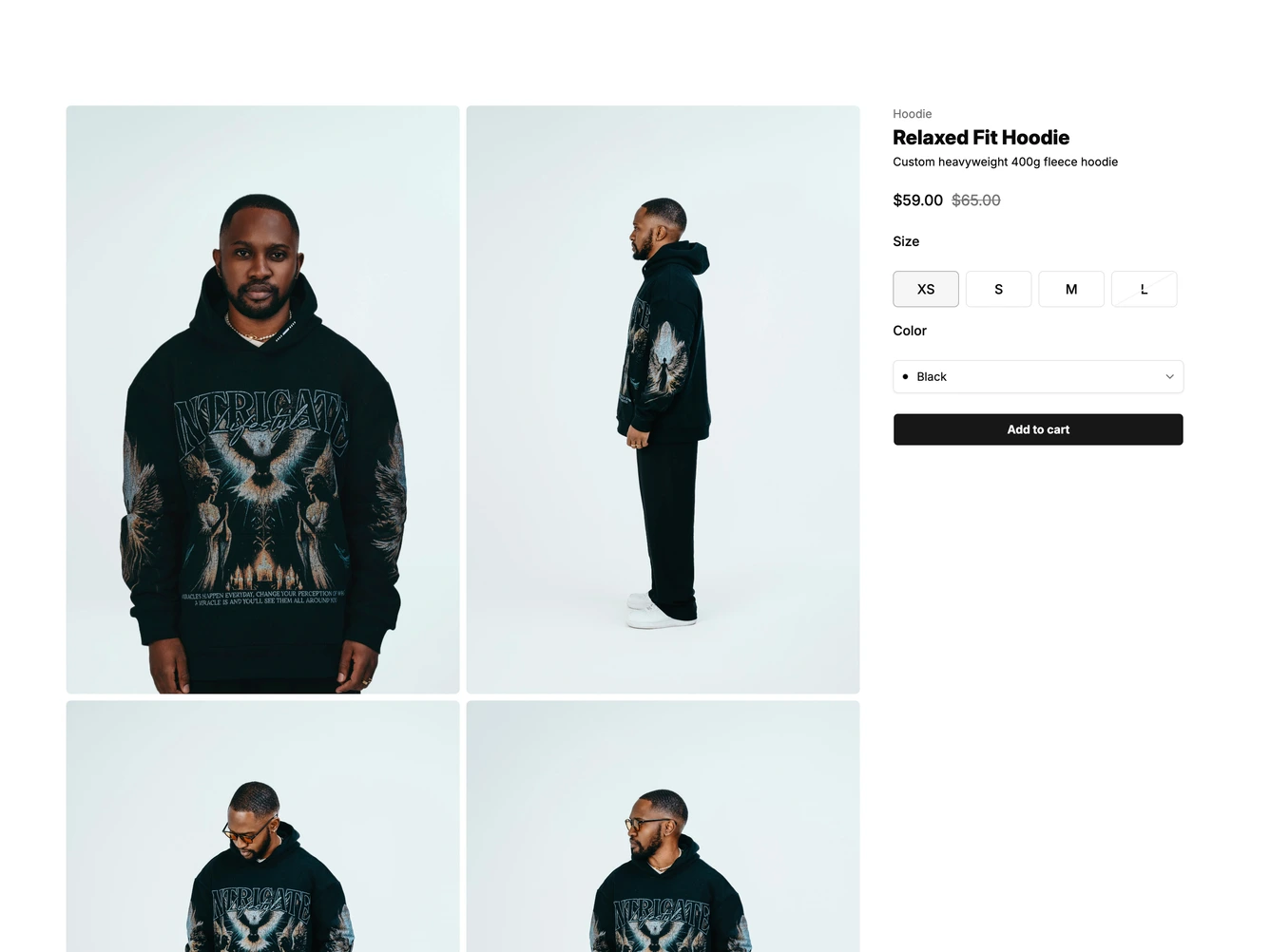
The block lays out a single product page built with shadcn/ui. Four tall photos sit in a two by two grid on the left, and a sticky column on the right holds the category, product name, subtitle and a sale price with the original price struck through.
Below the price is a row of compact size buttons, with sold-out sizes crossed by a faint diagonal line and disabled, then a color dropdown with small swatches and a full-width add to cart button. Pressing it crossfades the label to a ticked "Added to cart" for two seconds before it fades back. A product details section underneath pairs a description with a ruled specifications list.
Clicking any photo opens it in a PhotoSwipe lightbox. The size and color choices run through a validated form, and the product name, prices, options, images and specifications all come from one data object at the top of the file. On mobile the photos stack above the details.