
Product Categories 9 block design & features
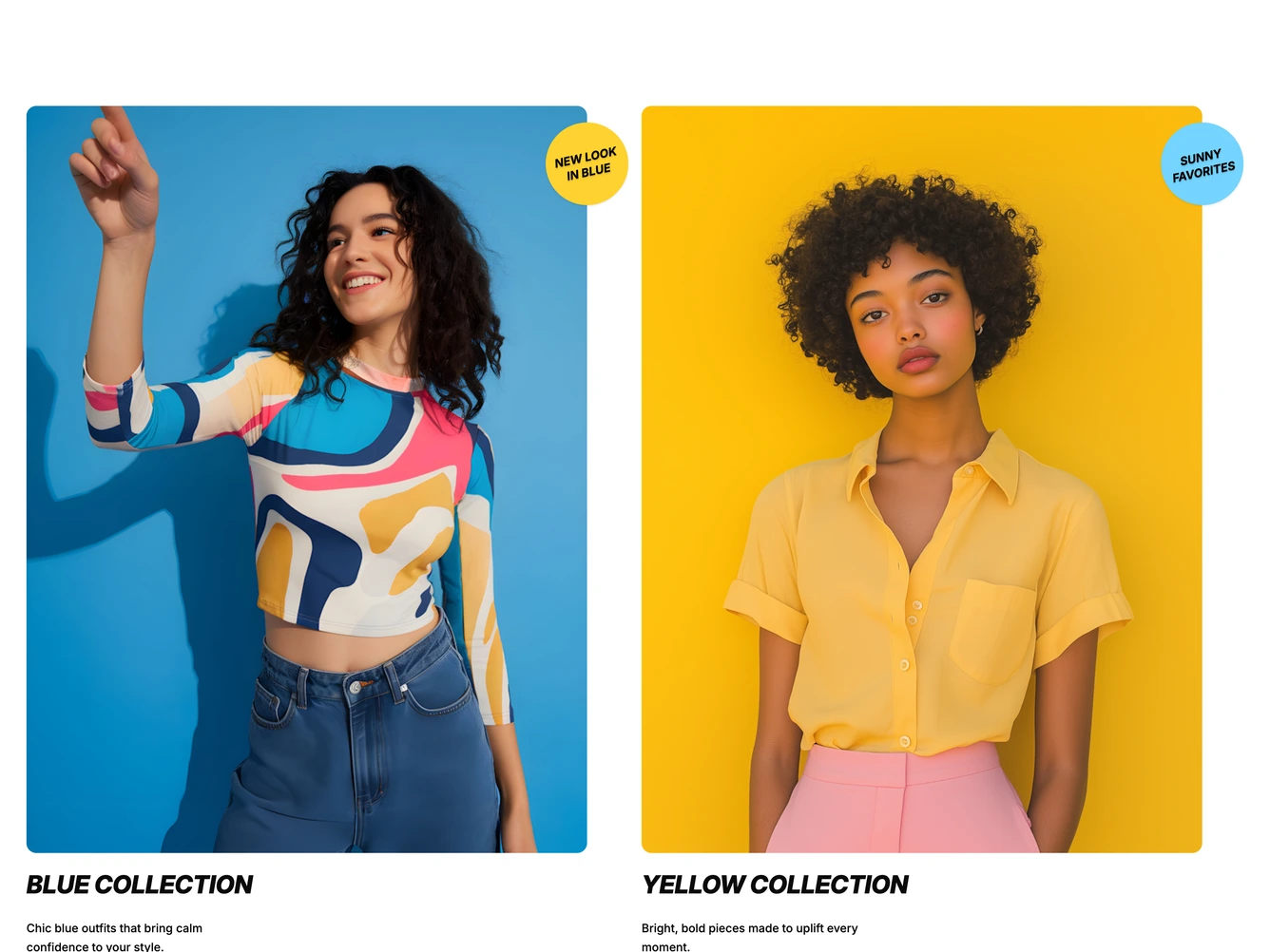
The block presents two collections side by side. Each card has a tall photo on a saturated backdrop with a round badge overlapping its top corner, its short label set at an angle. Beside the photo on extra large screens, and below it on smaller ones, sit a bold italic uppercase title, a short description and an underlined Shop Now link. It is built with shadcn/ui.
Hovering or focusing a card crossfades its photo to a second look from the same collection, thickens the link's underline and opens an arrow beside it. The collections, including their images, hover images, titles, descriptions, links and badge text and colors, are props. Transitions are skipped when reduced motion is preferred.
Below the large breakpoint the cards become a swipeable carousel that shows about three quarters of a card, so the next one peeks in from the right.