
Product Categories 6 block design & features
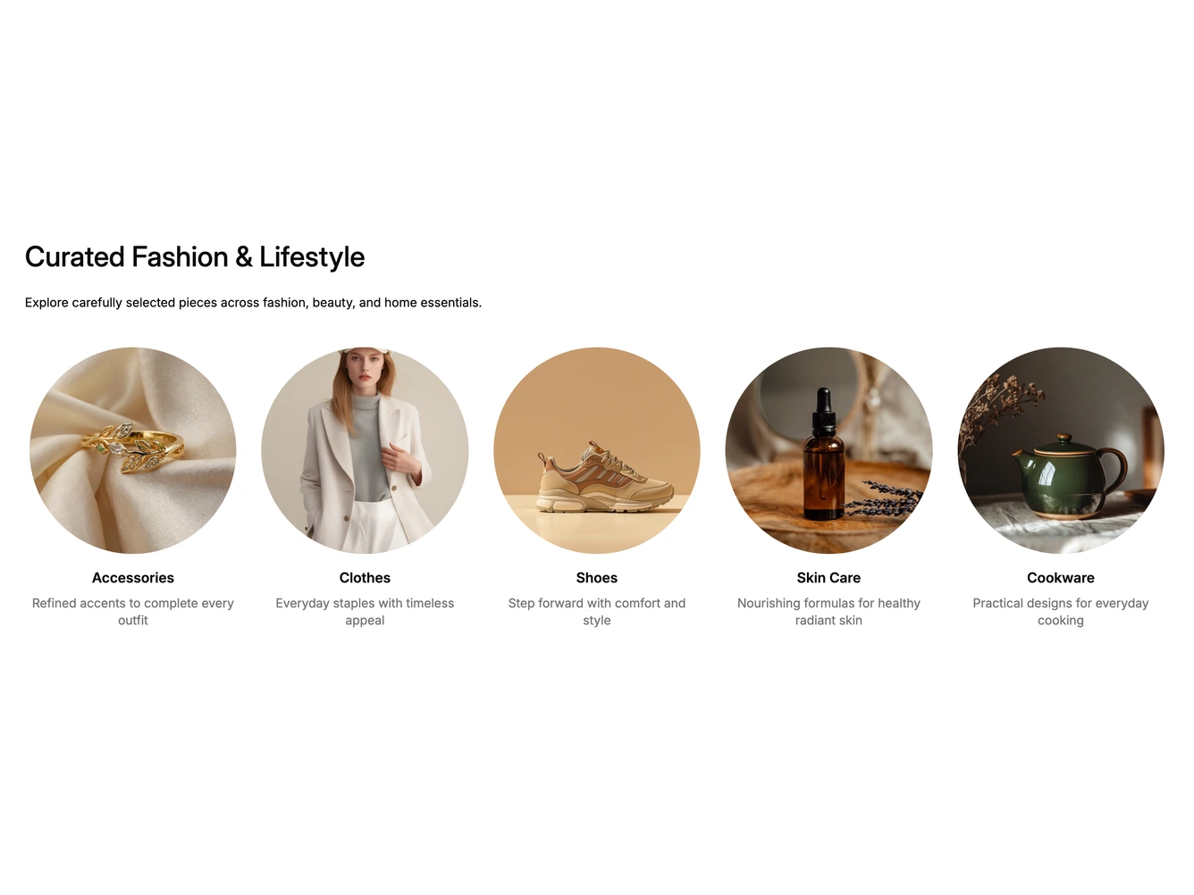
The block lists shop categories as circles. A left-aligned heading and short description sit above a row of five round photos, each with a bold category name and a one-line summary centered underneath. It is built with shadcn/ui and the Carousel component.
From tablet width up the categories sit in a fixed grid with no scrolling. Each circle and its text link to the category page. Hovering a category draws a thin ring around its circle, dims the photo under a "Shop now" label, underlines the name and darkens the summary. The heading, description and the list of categories with their images, names, summaries and links are props.
On mobile the row becomes a carousel that shows one or two circles at a time, with small dot buttons below that jump to each slide and highlight the current one.