Product Categories 26 block design & features
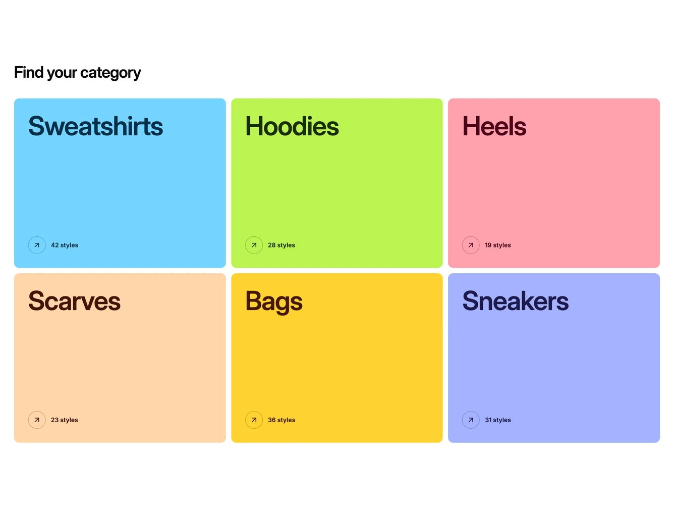
The block sets a heading above a three column grid of category blocks. Each block is a single flat colour, such as sky blue for sweatshirts, lime for hoodies and rose for heels, with the category name set very large in a deep shade of the same colour, a style count and a round arrow button. A product shot of the category waits inside each block. It is built with shadcn/ui and plain links.
Hovering or focusing a block wipes its product photo up from the bottom edge, filling the right side of the block. The studio photos are multiplied into the colour so the light backgrounds disappear and the products read as tinted cutouts against it. The arrow button fills with a faint tint of the text colour at the same time. There are no gradients, shadows or borders, only flat colour, bold type and the photo.
The look is bold and playful, in the spirit of colour block poster design, and it is a less common take on category navigation that relies on type and colour first. It needs one product shot per category on a plain light background so the blend works. The heading and categories, with their titles, counts, links, colour classes and images, are props. On mobile the blocks stack in one or two columns and show their product photo without needing a hover, and the wipe is skipped when reduced motion is preferred.