Product Categories 23 block design & features
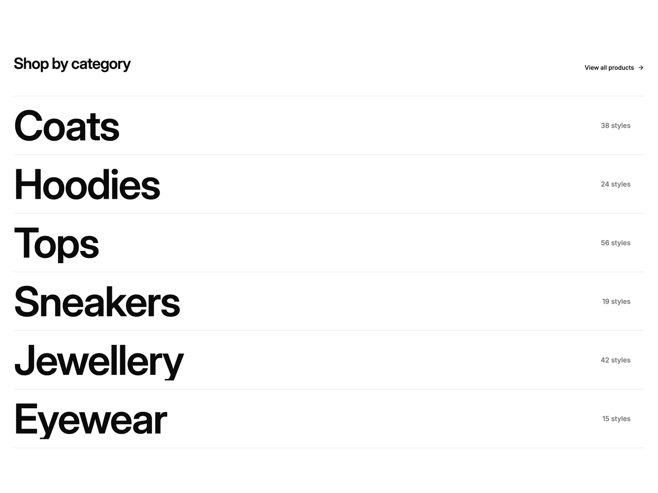
The block is a single-column index of shop categories. A heading and a View all products link sit above a stack of rows divided by hairlines, and each row holds a very large category name on the left with a style count and an arrow on the right. A portrait photo card belongs to the list and appears only while a row is hovered or focused. It is built with shadcn/ui and plain links, without extra components.
Moving the pointer over a row fades the other names back to a muted tone and reveals the photo card with a short clip opening from its middle. The card trails the cursor with a soft eased follow, and moving to another row crossfades its photo to the new category rather than swapping it. Keyboard focus anchors the card beside the focused row. The surface is flat and borderless apart from the row rules, so the type does the work and the photography only appears on demand.
The look is editorial and typographic, closer to a fashion lookbook index than a card grid, and it needs one portrait photo per category. The heading, the all products link and the categories, with their names, counts, links and images, are props. On mobile the cursor card is replaced by a small square thumbnail at the start of each row, and the follow and fades are skipped when reduced motion is preferred.