
Product Categories 22 block design & features
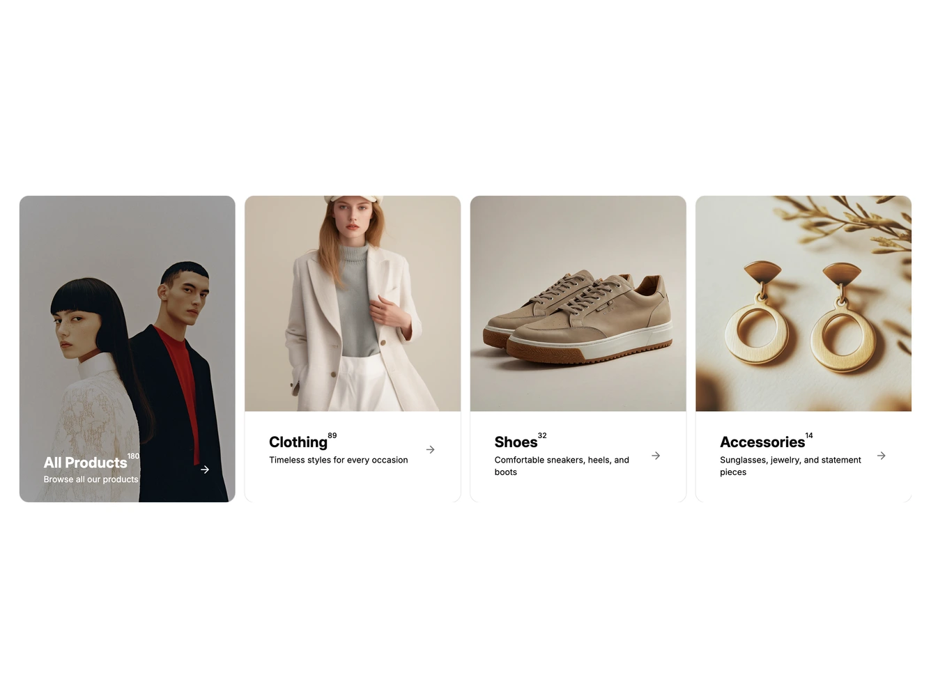
The block lists shop categories as cards. The first card is a full photo with a darkened overlay and white text for all products, and the cards after it pair a square photo with a footer. Every card shows the category name with its product count raised beside it, a one-line description and an arrow. It is built with shadcn/ui and the Carousel component.
Hovering a card draws an underline under its name, tints its footer, darkens the arrow and crossfades the description to a Shop line with the product count. The featured card's overlay deepens instead. When there are more cards than fit, round previous and next buttons fade in over the row on hover and appear only when there is somewhere to scroll. Each card links to its category. The featured card and the categories, with their images, names, counts, descriptions and links, are props.
On smaller screens fewer cards fit per view, and on mobile the row is swiped one card at a time.