
Product Categories 20 block design & features
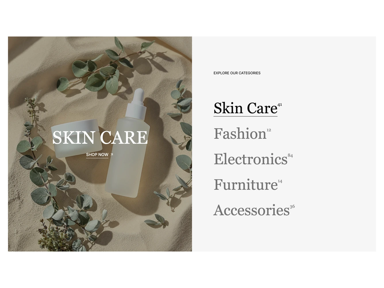
The block splits into a photo side and a list side. The photo shows the active category with its name in large serif capitals and an underlined Shop Now link. The list sits on a muted panel under a small label, with each category in large serif type and its product count raised beside it. It is built with shadcn/ui.
Hovering, focusing or clicking a category name underlines it, brings it up from the muted color and crossfades the preview to that category. Hovering the photo fades to the category's second image. The categories, their counts, images and call to action links are props. Transitions are skipped when reduced motion is preferred.
On mobile the preview sits above the list and both span the full width.