
Product Categories 19 block design & features
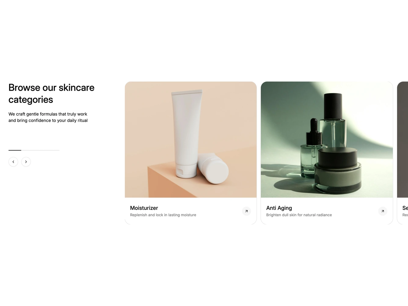
The block pairs a heading and short description with a row of large category cards. Each card has a slightly wide product photo, a category name, a one-line benefit and a round arrow button. The cards run off the right edge of the page. It is built with shadcn/ui and the Carousel component.
Two round outline buttons under the intro scroll the looping carousel one card at a time, and a thin progress bar above them slides to show the current position. Hovering a card underlines its name, outlines the card and fills its arrow with the primary color. Each card links to its category. The title, description and the categories with their images, names, descriptions and links are props.
Below the large breakpoint the intro sits above the carousel with the arrows beside it. On phones the text is centered, the arrows are hidden and the cards are swiped.