
Product Categories 14 block design & features
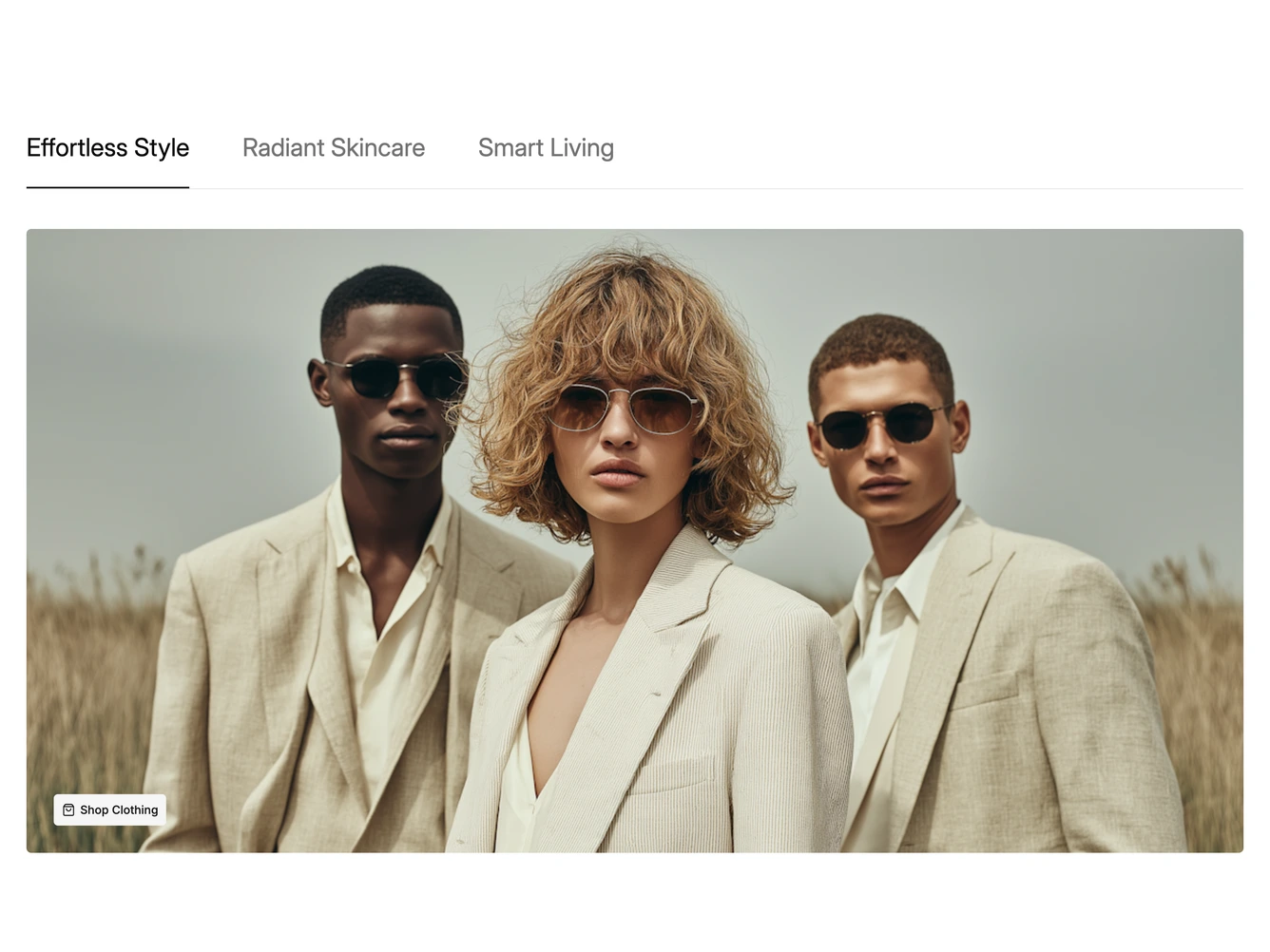
The block lets shoppers switch between a few themed categories. A row of large text tabs sits above a hairline, and below it is a wide rounded photo with a light button and shopping bag icon in the bottom corner. It is built with shadcn/ui.
Selecting a tab crossfades the photo and button to that category, and a single underline glides along the hairline to sit under the active tab. Inactive tabs are muted and darken on hover, and the arrow keys move between tabs. Each category's title, image and button text and link are props. Transitions are skipped when reduced motion is preferred.
On narrow screens the tab row scrolls sideways.