
Product Categories 13 block design & features
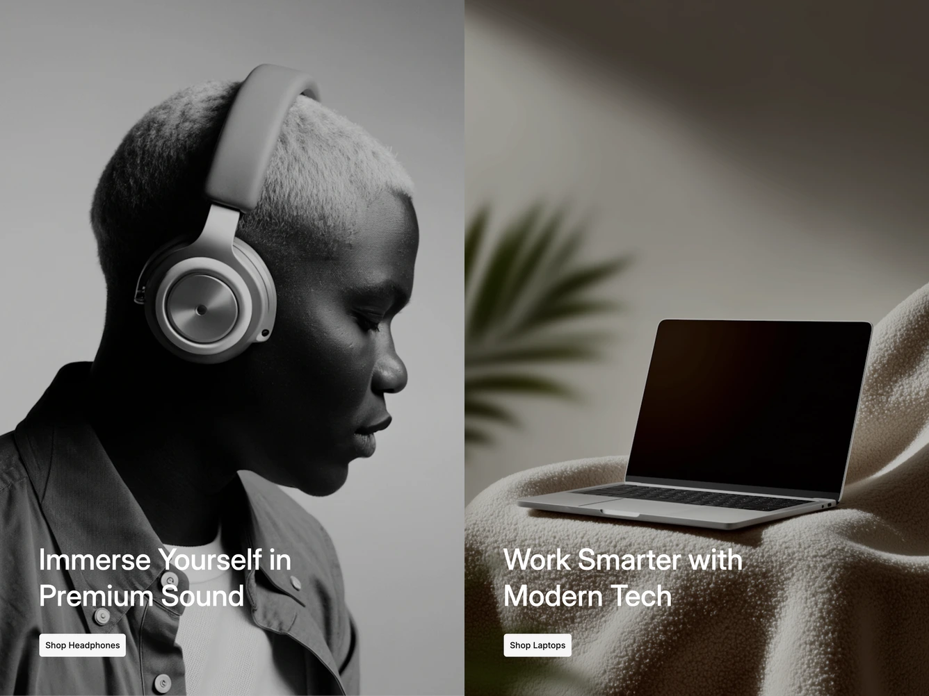
The block splits the width into two tall photo panels, one for headphones and one for laptops. Each panel has a darkened photo, a large white heading near the bottom and a light button that links to the category. It is built with shadcn/ui and the Carousel component.
The whole panel is clickable. Hovering or focusing a panel opens a short description under its heading, while the other panel's overlay deepens to push it back. Each panel's title, summary, image and button text and link are props. The panels fill the screen height on large displays, and transitions are skipped when reduced motion is preferred.
On tablets the panels stack as two shorter strips with their descriptions showing. On mobile they become a carousel showing one at a time, with pill indicators in the bottom corner that jump between them and stretch to mark the current one.